Graphics and visual design are important. Photography is important. We’ve said many times that aviation consumers are a VERY visual bunch and great art and design is incredibly important.
That said, we hear all the time from aviation companies who were talked into big, expensive design projects by big, impressive advertising agencies. And many times, there is a certain amount of, I’m going to say, bullying, obfuscation and intimidation that goes into those transactions.
Now, don’t get me wrong – we would be the first to encourage people to advertise, and good design costs money. You’d be amazed at the amount of work that can go into a “simple” design – simple often takes a lot more time and effort than a more complex design. And let’s not get started on photography. The detailing, cleaning, light-adjusting and nit-picking that goes into a great photograph comes as a huge surprise to people who have not been on an aviation interior or exterior photo shoot.
But the rates that some of these agencies charge, and the lack of understanding of the aviation market that they exhibit, simply don’t warrant tens or hundreds of thousands of dollars. We’ve seen great aviation companies go out of business, at least in part because of a huge financial hit from an advertising contract that didn’t pan out when that money was badly needed for product development.
Just like there are shady characters in SEO and other technical fields that will take advantage of the fact that people don’t understand what they do, there are also shady characters in art and design that take advantage of what people don’t know.
![]()
![]()
![]()
Transcript – Art as Voodoo
Paula Williams: Welcome to aviation marketing Hangar Flag episode number 30, Art as Voodoo and Visual Marketing. I’m Paula Williams.
John Williams: I’m John Williams, and together we are ABCI.
Paula Williams: ABCI’s mission is to help you folks sell more products and services in the aviation industry. So if you would like to reply to this episode or comment on anything you hear, here or on anything else really, like our website or webinars or anything else, use the #AvGeekMarketing,
And we promise we will reply to every tweet and make sure that you’re included in the conversation. So our motto is, no random acts of marketing. You really want to know what you’re doing and why. And one of the weird things that has happened in marketing and advertising, probably since the Mad Men days, is something I’m going to call artist voodoo.
The people that do advertising are going to try to make you feel like they know more than you do about your product or service and about your customers and about a lot of different things. And they’re going to do a really dramatic unveiling of a fantastic new logo or whatever.
And even if it’s something you completely don’t understand and don’t like, you’re going to be afraid to say so because they’re the artist, right?
John Williams: In the days of the Mad Men and Madison Avenue marketing firms, they all did designs and did stuff like that so they could win prizes.
Paula Williams: Mm-hm.
John Williams: They didn’t really care about the product per se. They wanted to win the marketing of the year award or whatever it was so they could-
Paula Williams: The ADDIES and the CLIOs and yeah, all of those fabulous awards.
John Williams: Not many folks can afford those kind of people anymore [LAUGH] .
Paula Williams: And you really don’t need to worry about that. In a lot of our cases we love great design as much as anybody. But there’s, I’m going to say, kind of a divide between some of the folks in aviation that are very, very practical people who would go to a modern art museum maybe, and John’s our perfect example of our perfect demographic of a customer.
We went to some of the museums in Paris, when we were there a few years ago, and looked at some of the, especially the modern art, I’m going to say, and your reaction was.
John Williams: [LAUGH] Probably not good cohorting with you [LAUGH].
Paula Williams: Well, it did not hit you in the way that maybe the artist intended, or maybe it did hit you in the way the artist intended.
John Williams: No, I like all the older stuff, but this, I don’t remember what they call it where they rough it up and make it sort of blurry.
Paula Williams: The impressionists?
John Williams: Yeah.
Paula Williams: And later, most of the modern stuff, I don’t remember you liking anything that was probably later than about 1970, I think, in some of those museums.
Some of the weirder stuff, I’m going to to say, is not going to hit our demographic in the best possible way for the aviation market. Pilots and other folks in aviation are very, very visual people, so they really like good design. They really respond to photographs. They really respond to what I’m going to call airplane porn, which is where they show pictures of fabulous, beautiful perfectly created sparkly airplanes that everybody would love to have in their hangar.
It’s a fantasy kind of art that works really, really well with these folks. And then there’s other kinds of art that just kinds of falls on its nose, right? Okay.
John Williams: For aviation folks you’re absolutely correct.
Paula Williams: Okay, so yeah, and the main thing that I want to talk about here is don’t let your artist or your designers boss you around.
In a lot of cases they’re very good at this and their entire way of doing business is set up to be intimidating, basically. So they’re going to present you with something that you may or may not like. And their modus operandi is to reduce the amount of criticism and get your check as quickly as possible.
So don’t put up with design that you don’t like, with a logo that you’re not happy with, with anything that comes from an artist or a designer that doesn’t work for you.
John Williams: And there’s good reason for that. A couple years ago we had a client who had spent a quarter of a million dollars on a website.
Paula Williams: Mm-hm.
John Williams: And it looked beautiful, I mean, even to me, yep. Crisp, clean, everything is great. And had never made one sale from the website.
Paula Williams: Right, and in that case it was good design. It was actually very, very aesthetically pleasing, even to their target demographic. But in other cases, we’ve had clients say, I’ve never been really happy with my logo, but I paid a lot of money for it.
John Williams: [LAUGH] Yeah, right?
Paula Williams: And that is never a really good reason to just go with something because you paid a lot of money to a fancy, respectable designer.
John Williams: Yeah, because then you’re throwing good money after bad.
Paula Williams: Absolutely. So if you’ve made a mistake in the past and you’re not happy with your branding, there’s nothing wrong with going back to square one or at least tweaking it until it’s something that you do like.
So this is not rocket science, right? Visual designs should support your message, right?
John Williams: Absolutely.
Paula Williams: And that should be everything, your logos, your symbols, your icons, your colors, your fonts, photographs that you use, and so on. They’re really designed to evoke an emotional response. And probably the very best example of this is where they have the little kid with the toy airplane that really takes most people in aviation back to the time when they were a little kid and they were dreaming about when they would be able to play with airplanes.
And I think that’s a great image, maybe a little bit overused, but it’s a perfect example of what we’re saying here. That’s an image that supports an idea. The only reason for using visuals in your marketing is to convey an idea and to convey your message more powerfully than you would with words alone.
If it doesn’t do that, then for God’s sake, don’t spend any money on the image, right?
John Williams: [LAUGH] Absolutely.
Paula Williams: Okay, so I’m glad we agree on that.
John Williams: [LAUGH]
Paula Williams: Abstracts, other kinds of things, unless it conveys your message or supports your message, then you really shouldn’t be spending money on it.
So what we’ve done at ABCI, we had a product that had lousy branding, basically. It was something that we hadn’t spent a lot of time on it. We had the cobbler’s shoes syndrome. We were spending a lot of time on our clients’ marketing and had never spent any time on the marketing for this product.
John Williams: Heaven forbid.
Paula Williams: Heaven forbid. So we have the cobbler’s shoes, the cobbler’s children have no shoes. And I’m sure you’ve heard that story, where the cobbler is so busy making shoes for all of his clients that his own children are going to school with no shoes. So our poor product is running around with really horrible branding because we’ve just not spent the time and energy on it that we should.
And this is our aviation marketing Master Class. We put together a logo a couple of years ago and just kind of slapped it on there and went forward with it because we needed something quickly, and moved on with a lot of projects that were happening at that time.
So what we’ve done instead and I’m going to walk through this process because it might be helpful to other people who may or may not know anything about art or history. And I promise that I’m not going to get nerdy about lines and forms and shapes and all that stuff.
John Williams: And if she does, I’ll, ahem.
Paula Williams: Bring us back down to planet Earth.
John Williams: [LAUGH]
Paula Williams: And talk about this sort of thing. Now you have to understand, I love art history. I completely nerded out on that in high school, and I had a fantastic teacher who did a lot of work with us, helping us understand a lot of the reasoning behind art.
And she said, you never really understand a time period until you understand the art that’s being produced by the people of that time. But the reason that we’re going to talk about themes and periods and things like that in art, is because it saves you a lot of time when you’re talking about art.
It’s an established shorthand. It’s already got a harmonious matching of colors, lines, fonts, shapes, and so on. And somebody has already done the work for you. So we looked through a bunch of art history books and a bunch of websites and other kinds of things to figure out what we liked that we could steal.
John Williams: We in this case means she mostly [LAUGH].
Paula Williams: Right, but then I ran it all by John as our target market to see what he liked as well. And some of the reactions that he had and some of the responses that he had, he hadn’t thought through why it makes him feel that way, but I can tell you some of the reasoning behind it.
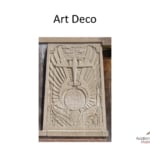
So the Art Deco period is, basically it started with a exposition in France right at the beginning of an industrial period in between World War I and World War II, when people were looking at machines, going, wow, this is fabulous. Airplanes are fabulous, trains are fabulous. The whole idea of mechanizing things is a wonderful thing.
And at that time, they hadn’t really gone through all of the ethical dilemmas of, are we doing a good thing or a bad thing or anything else. They were just really enthusiastic about man and machine and the great things that people can do. And this kind of carried on for quite a while.
And you can see examples of Art Deco art and architecture all over Europe and the United States. One of my favorite examples is at Hoover Dam. If you’ve ever been to Hoover Dam and you look at some of the art that’s there, it’s kind of surprising, cuz you’re thinking, this is in the middle of the desert, this is a really utilitarian dam that was just meant to supply Las Vegas with water, right?
John Williams: And electricity.
Paula Williams: And electricity, but you know, they have these enormous cast concrete guardian angels sitting over the top of the dam. And apparently they’re doing their job because they’ve never had any major incidents at Hoover Dam. But these are examples of Art Deco design. And you think about the people that did this work.
They didn’t have any qualms about should we really be building a dam here. And the people that they actually killed in the process of building the dam and all of that stuff never entered into the equation. It was all just completely optimistic, fabulous, beautiful work, right? And so you’re seeing some of the lines and shapes.
It’s all about machines are beautiful, right? If you were to say this is what this period in art is about, right?
John Williams: I think we can slide by the art history 101. I think we need to get on with it here [LAUGH].
Paula Williams: All right, [LAUGH] fine. So the point being, you can take a period like Art Deco and you can say, here are some colors and some shapes and some fonts and some other things that we can use that have already been used to convey a particular idea.
And that is an idea that works really, really well with our aviation marketing Master Class, right?
John Williams: Yeah, the thing about all this stuff that you can just use is, it was been proven successful in the past.
Paula Williams: Exactly, so people spent a lot of time and money putting a lot of art together because it conveyed the feeling and the ideas that they wanted to convey.
So if our idea is similar to an idea that was done by a great artist and things like that, then by all means. And I don’t mean steal literally, because we’re not going to build the Hoover Dam or use this as our logo or anything else. But some of these straight and curved lines, a lot of the colors that you’ve seen in a lot of the Art Deco work, some of the fonts that they use, things like that.
Those are things that we can use and it’s, I’m going to call it a visual shorthand to a particular idea. And when people see those things, like the cover of Atlas Shrugged is a pretty good example of Art Deco art. If you pick up a copy of that, the cover is most likely a pretty famous Art Deco design with Atlas holding up the world.
And those fonts and those rays of light and everything else coming out of that painting, most of us have seen that, and it conveys a certain idea that humans and capitalism and all that stuff is a positive, wonderful thing. And that’s exactly the feeling and the idea that we want to convey.
So actions. What does this all mean, right, now that we’ve come back from Art 101? Thank you, John. Thing number one, don’t be afraid of artists, okay? Don’t just hand them your money, okay? You really want to think about the ideas that you want to communicate, and this is something that can be explained.
And any artist or designer that you work with should be able to speak English and explain to you what they’re doing and why, and you should agree with what they’re doing. And you may also want to consider a visual theme for your branding. If you’re starting over with a new brand, or if all you’ve got is a logo and you’ve realized, we really need to beef this up and have a little bit more of a cohesive visual appearance.
Grab an art history book and look through it and come up with maybe a time period or something like that. And I don’t mean this in a snotty way.
John Williams: Of course not.
Paula Williams: There was a movie, True Lies, where Arnold Schwartzenegger walks up to this girl who’s an art curator for some big company or whatever, and they’re looking at this big Persian sculpture and stuff like that.
I don’t even remember what time period it was, but she walks up to him with this glass of wine in hand and says, do you like the period? And he says of course, and he rattles off all of these statistics about the art. We’re not talking about snobbiness like that.
We’re talking about what art really conveys and how you can use it to your advantage so that you don’t have to go through all of the decisions. Somebody’s already done all that work for you, right? Okay, so our freebie this week, still, is the Aviation Brand Design Brief Template.
If you have not downloaded that, make sure you do. That really helps you capture a lot of that hard work that you worked so hard to collect, the fonts, the colors, the lines, the symbols, and other kinds of things. And make sure you document all of that stuff so that you’re able to just hand that to your printer, hand that to your designer, hand that to anybody that you’re working with, photographers and so on.
So that they know how to keep the work that they’re doing for you consistent with the work that’s been done before, right?
John Williams: Yeah, anything that goes out of the office to potential customers or customers, it needs to be consistent with what you’ve decided upon.
Paula Williams: Absolutely, right.
So go sell more stuff. America needs the business.
John Williams: Our good friend, Zig Ziglar. [LAUGH]
Paula Williams: Not that we knew him personally, but it is a really good quote to end on. And make sure you subscribe to our podcast. We are on iTunes, Sticher and Google Play.
And please also leave us a review. And we’ll see you next week.
John Williams: Ciao.
