As you’ve probably guessed, this whole series is just so that John and I have an excuse to share our vacation photos.
But we do have a couple of points to make here:
- With your aviation marketing analytics – are you looking at the right things? How do you know what numbers are good?
- With the marketing you create for prospects and clients – how do you explain and/or present your data?
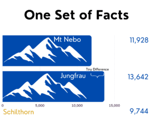
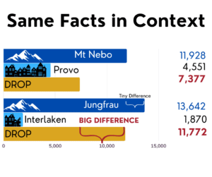
In the case of the Swiss Alps and why they seem so much higher than the Rockies in Utah, it’s the contrast, not the altitude!
What does this have to do with marketing? Sometimes presenting “just the facts” doesn’t give people a real picture of what is important.
Seeing is still believing, but as marketing professionals, we have a lot of choices to make about what images to present and why.
What’s the best way to present data? Some ideas to consider:
✈️ Before/after comparisons
✈️ Infographics. (Does the difference between YOUR product and the competition show up best in a photo or in numbers?)
✈️ Photos. Of course, photos taken from a different angle tell a completely different story!


There is only 2K difference (more or less between Jungfrau, the tallest mountain in Switzerland vs. Mt. Nebo, the tallest mountain in Utah.
However, there is a 4,500 difference in the DROP between Jungfrau and the nearest city, Interlaken versus Mt. Nebo and it’s nearest major city, Provo Utah.
So, the Swiss Alps SEEM much higher because of the BIG DROP! Context is everything.
And the pictures show it much better than infographics in this case!
Podcast: Play in new window | Download
Subscribe: Spotify | Amazon Music | RSS
